Modern
From User to Visitor
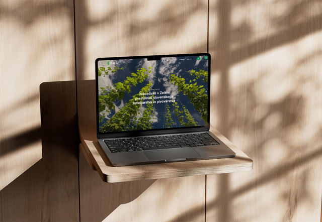
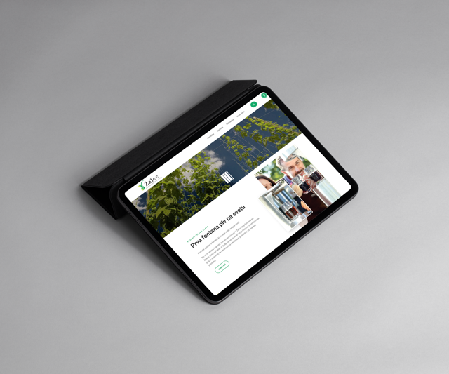
In recent years, Žalec has been rapidly developing in the direction of tourism, but the destination's website has not kept pace, becoming a repository of content. In her research, Martínez-Salova argues that it is the characteristics of a website in the tourism sector that help create user preferences for a travel destination. Therefore, together with Tourism Žalec, we assessed that the site needed a thorough overhaul in terms of visual updates, clarity, and user experience. The existing site lacked clear information, making it difficult to find important content. Our task was to create a modern website where the offerings are clearly separated from accommodations and culinary experiences, allowing visitors to quickly access information.


| Client |
ZKŠT Žalec
|
| Service |
Web pages and apps
Creative and design
|
| Team |
Diana Gajić
Darja Štukelj Rus
Klara Bohnec
Tomo Turk
Žan Mlinarič
|
| Year | 2024 |
Modern Tourist Portal
The redesigned website now functions as a modern portal where tourists and visitors to Žalec can quickly access the information they need. To achieve this, we clearly separated the tourist offerings (experiences) from accommodation and culinary options. To make the new site even more user-friendly, we tailored the content to users' searches and divided it into sections for exploring, experiencing, and trying local attractions. We specifically highlighted content such as accommodations, culinary options, excursion ideas, and major attractions, which are also presented on an interactive panorama at the bottom of the page. The site is multilingual, further enhancing accessibility and user experience for a broader range of visitors.


