Floramare
The Miracle of Inclusion and Coexistence

| Client |
Floramare Health resort
|
| Service |
Digital advertising
Branding
Creative and design
Social media
Web pages and apps
|
| Team |
Lara Burkat Vončina
Anja Grabar
Darja Štukelj Rus
Tomo Turk
Matej Krmelj
Žan Mlinarič
Amelija Umek
Klara Bohnec
|
| Year | 2024 |
The Identity of the Health Resort
We designed the project with everyone in mind. The renovation not only brought a fresh name and look to the resort but also reflected the philosophy of harmony and equality in every detail. The new corporate identity, designed in warm gold, calm black, and gentle beige tones, symbolically represented the resort's rebirth. The logo, which combines elements of nature and symmetry in the form of a flower surrounded by an oval ring, reflects the dynamism and openness of our space. Such a visual transformation is not just an aesthetic change but reflects a deeper understanding and acceptance of guests from all walks of life.
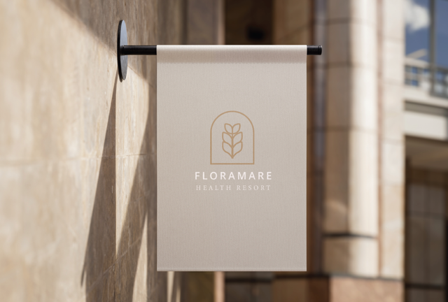
Visualization of the Image
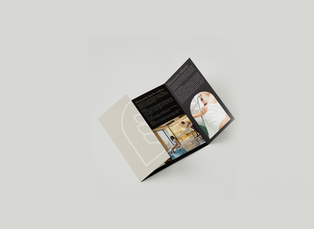
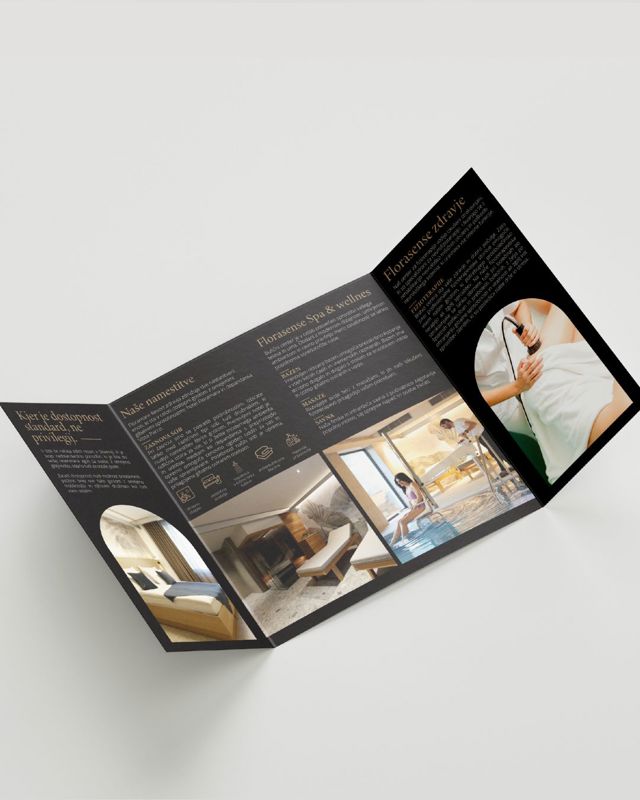
Our next phase focused on the tangible representation. By combining traditional serif fonts with modern script fonts, we created a sense of warmth and welcome. The materials that guests encounter, from greeting cards to birthday wishes, are designed to give every visitor a personal touch. The visual and textual components are intertwined in a way that makes each guest feel valued and respected.
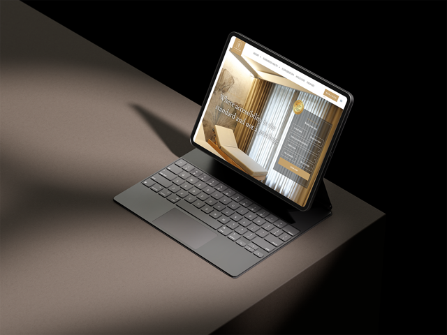
Accessible website
Results
Nearly 3,000 users visited the website in the first month after its launch, during which a digital campaign for advertising winter holidays was also running. The average time spent on the site is 1 minute and 37 seconds.


